On the basic income law, economic democracy, participatory economics, and the importance of the commons in the 21st Century: Further thoughts on an alternative philosophy of social change

See on Scoop.itGlobal Consensus

It appears to me that in majority of discussions about life after capitalism and possible social-economic alternatives, a very familiar anxiety tends to surface and resurface. This anxiety, I argue, is both existential and social in nature. It is the result of what I describe as one of the most fundamental philosophical problems of the 21st Century: namely that if capitalism, as a system of in-direct domination, emerged in history as an alternative to systems of direct domination; how might we then formulate, in the present, a truly progressive and emancipatory alternative without reproducing direct or in-direct systems of domination?

See on www.heathwoodpress.com
DON’T PANIC — The Facts About Population

See on Scoop.itGlobal Consensus

Don’t Panic – is a one-hour long documentary broadcasted on BBC on the 7th of November 2013.

The visualizations are based on original graphics and stories by Gapminder and the underlaying data-sources are listed here.
Hans’s — “All time favorite graph”, is an animating bubble chart linking health and wealth which you can interact with online here and download offline here.

Daniel LaLiberte‘s insight:

Key insight:  The number of children stopped growing in 1980.  Most of the world is now having only 2 children per family.  The reason why the adult population will continue to grow is just because it takes a generation to balance out the bubble of having more children that survive to grow up and have their own children.

See on www.gapminder.org

Wealth Inequality in America – YouTube

See on Scoop.itGlobal Consensus

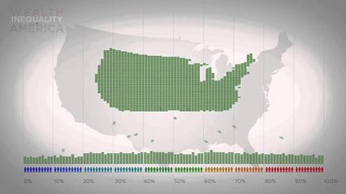
Infographics on the distribution of wealth in America, highlighting both the inequality and the difference between our perception of inequality and the numbers. The reality is often not what we think it is.

Daniel LaLiberte‘s insight:

This video uses simple graphics to very dramatically represent how extremely out of balance the distribution of wealth is in the US. The same is true across the world.  


It also shows how most people’s perception of this inequity doesn’t match how bad it really is.  I think this is largely because the relatively few wealthy people are mostly invisible.

See on www.youtube.com